

Design, guided by strategy.
Where lettering becomes more than form—it becomes meaning.
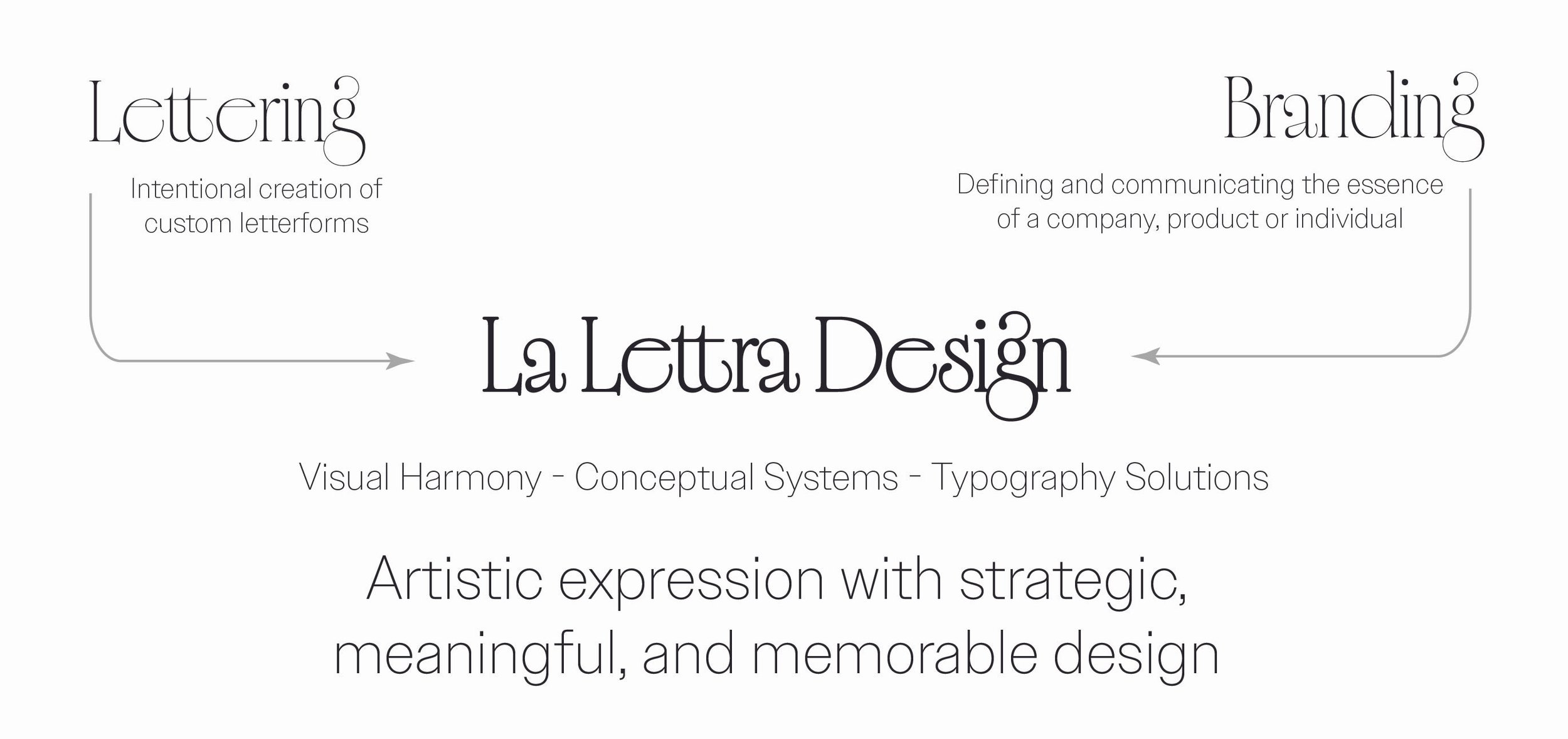
My approach to lettering is shaped not only by craft, but by a background in marketing. I don’t see a logotype as decoration—it’s a strategic asset, a first impression, and often the most recognizable expression of a brand.
By combining both disciplines, I design identities that are not only visually refined, but aligned with positioning, audience, and long-term brand value.
Every project begins with clarity.
I take the time to understand your brand beyond aesthetics—its positioning, audience, and the role the logotype needs to play within a larger system..
This strategic foundation ensures that every design decision is intentional, not arbitrary.
With a clear perspective, I define a visual direction.
Through references, tone exploration, and early sketches, I translate strategy into form—exploring how the brand should feel, not just how it should look.
This phase sets the creative boundaries that guide the work forward.
This is where lettering takes shape.
Each logotype is crafted with precision and care, balancing form, rhythm, and personality.
My focus is not only on beauty, but on distinction—creating something that feels unmistakably yours.
Details define the final result.
I refine every curve, spacing, and proportion until the logotype feels resolved, cohesive, and enduring.
The outcome is a mark designed to perform consistently across applications, while maintaining its integrity over time.
Craft meets strategy.
My background in marketing allows me to approach lettering with a broader perspective—understanding not only how a logotype should look, but how it should function, communicate, and evolve within a brand.
This results in work that is:
Intentional — every element serves a purpose
Distinctive — designed to stand apart, not blend in
Enduring — created with longevity, not trends, in mind
If you would like to discuss a project, I would love to connect to explore it. Whether it’s for a brand identity, campaign, book cover, or a special project, every collaboration begins with a conversation.